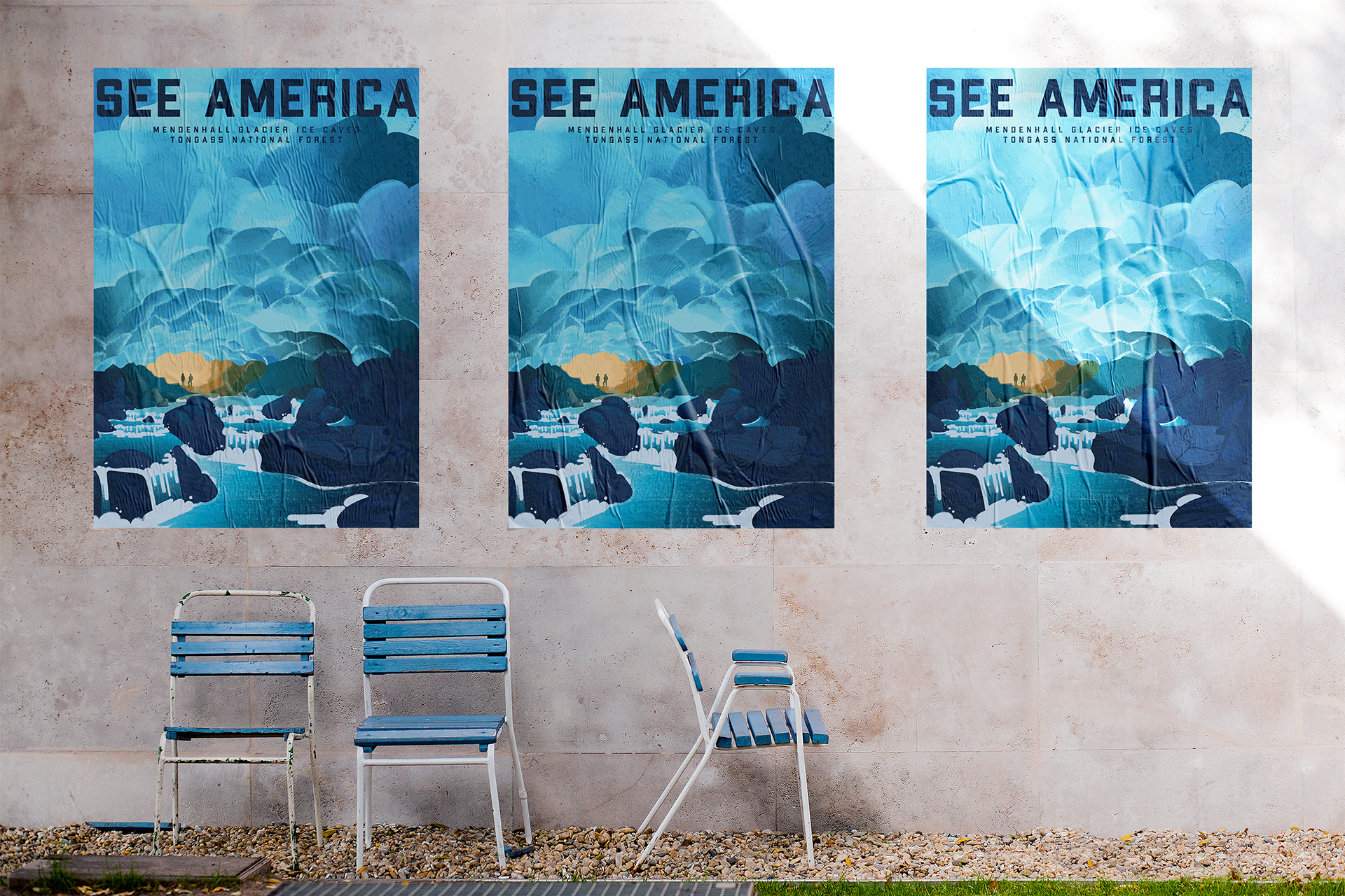
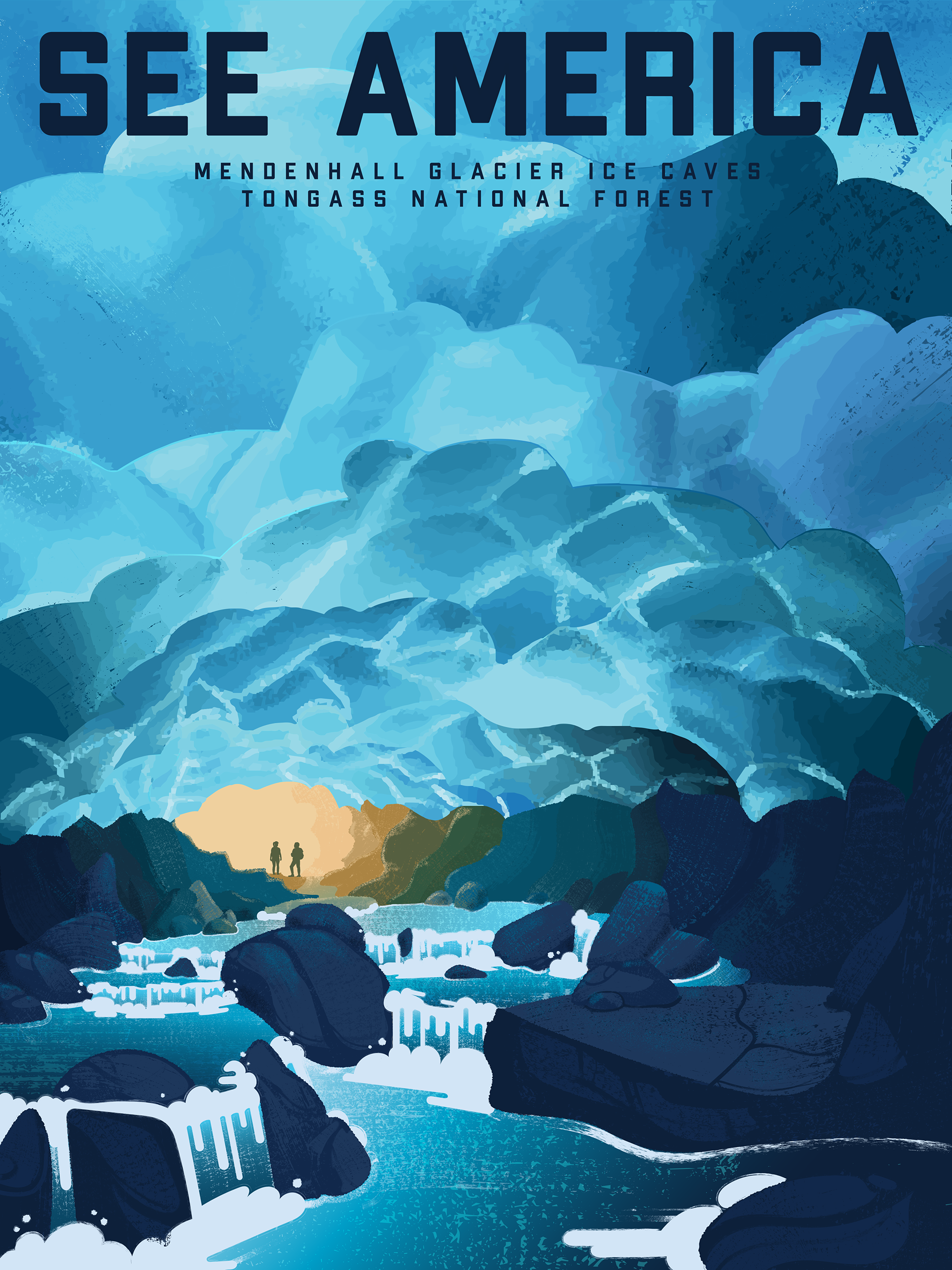
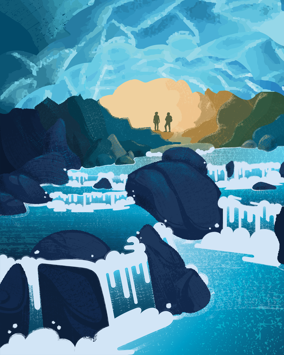
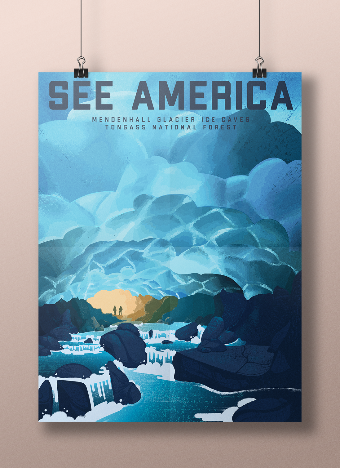
See America: Mendenhall Glacier Ice Caves
Services
Illustration
Poster Design
Illustration
Poster Design
Software Used
Adobe Illustrator
Adobe Photoshop
Adobe Illustrator
Adobe Photoshop
Research Phase: Part 1
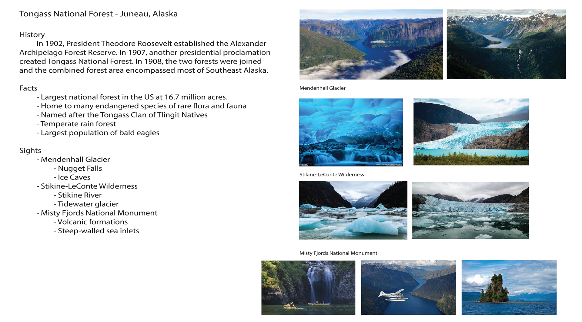
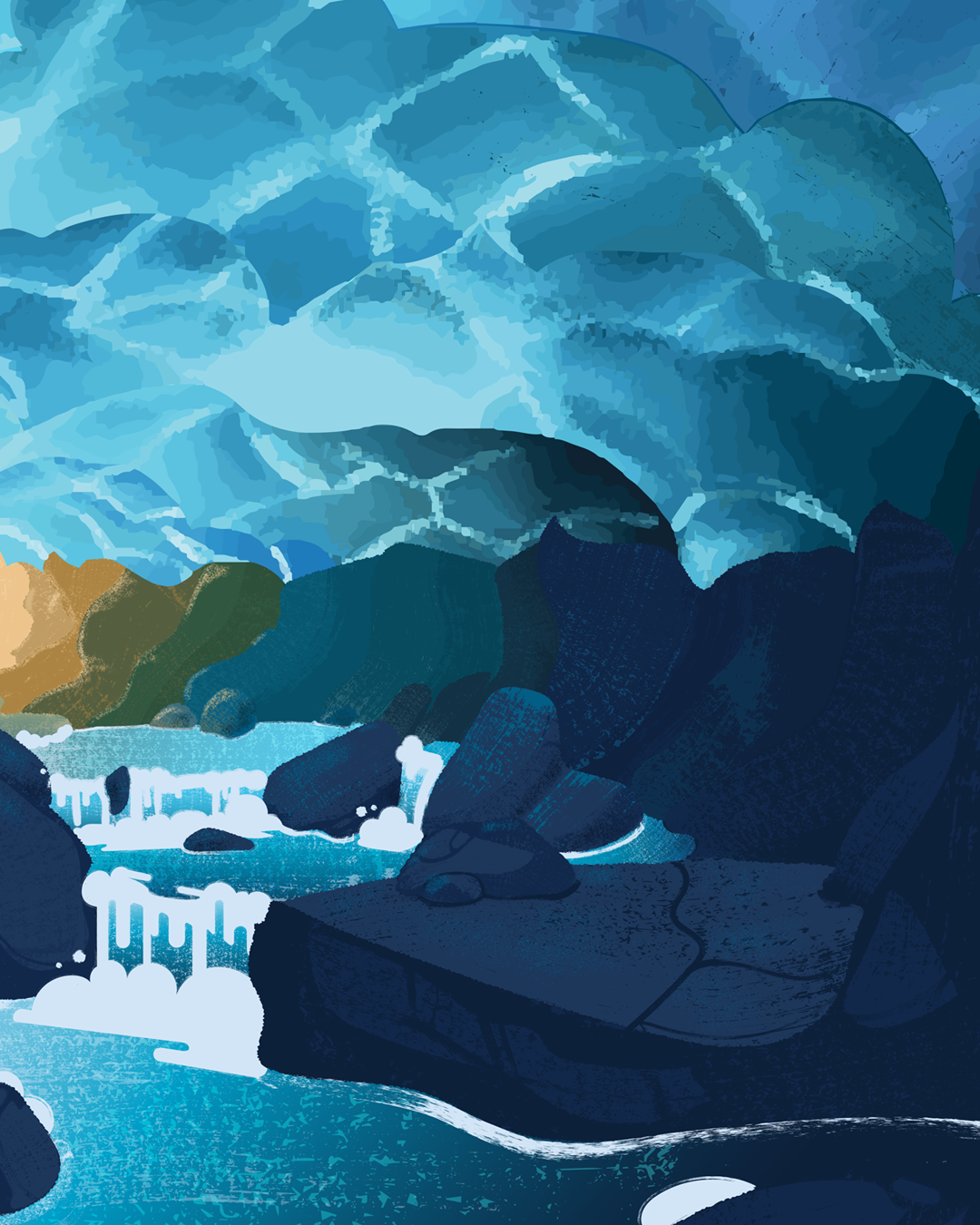
My goal here was to select and research a national park or other government protected area that resonated with me. The breathtaking photos of Tongass National Forest in Juneau Alaska left me in awe and wonder, specifically the enchanting ice caves inside the Mendenhall Glacier.
Research Phase: Part 2
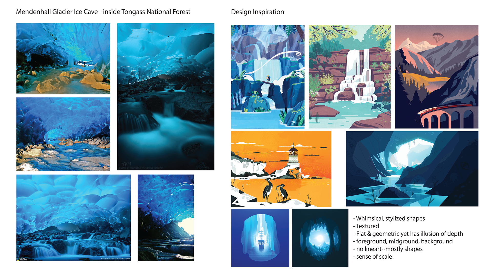
Next, I collected photos inside the cave to reference as I sketch. I believe collecting strong references always ends in a better result. I also created a moodboard of beautiful artworks to inspire my design decisions. From these, I extracted my stylistic goals for my poster.
Handmade Asset Creation
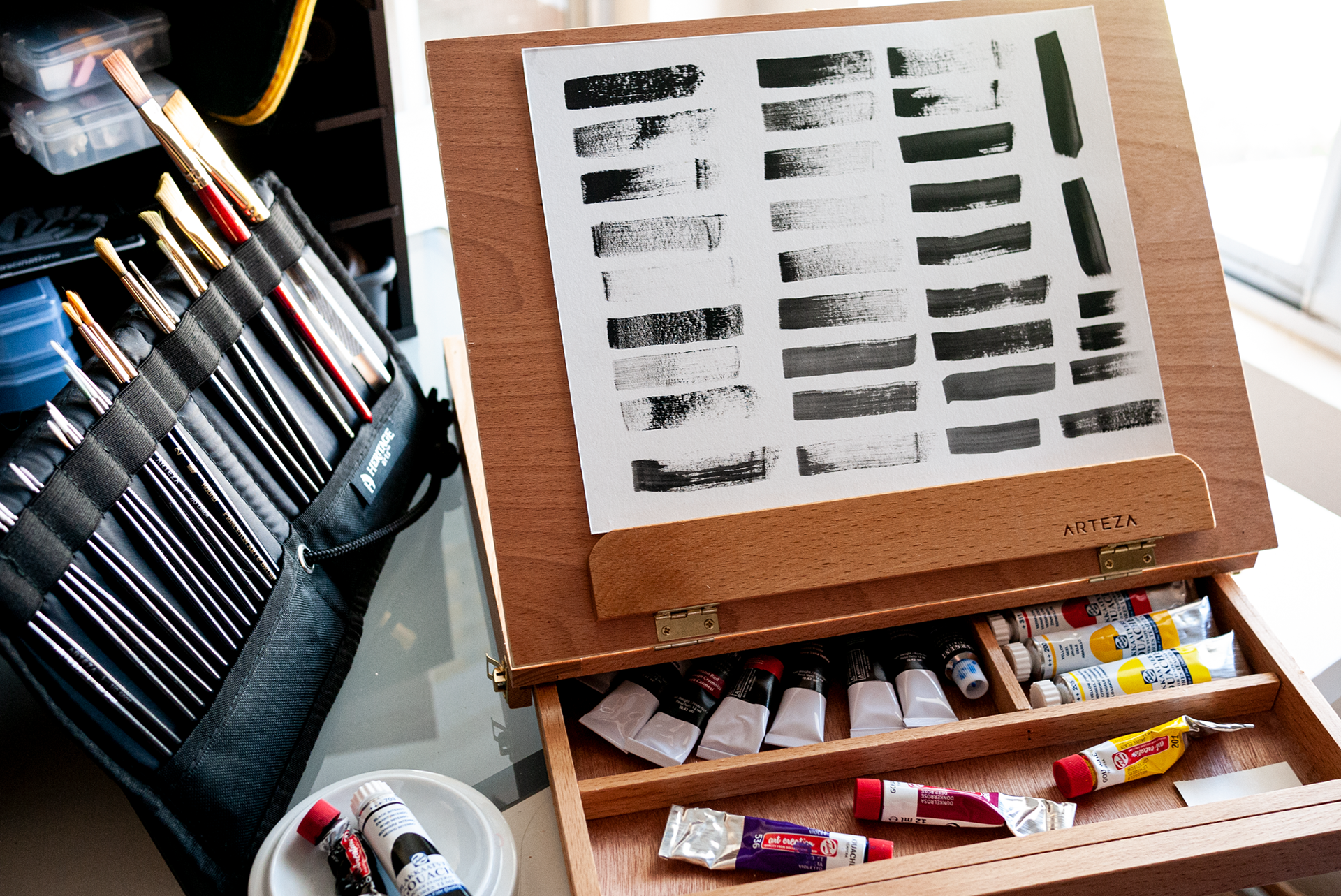
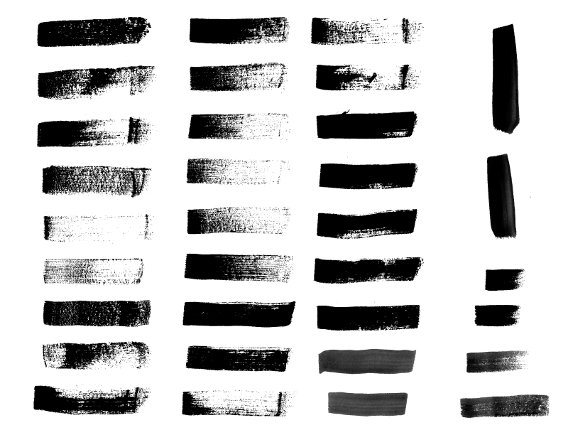
In order to achieve my desired hand-painted, whimsical effect on a vector-based image, I decided the best course of action was to create my own brushes and textures. Using black gouache and a dry, flat tip brush, I painted a variety of strokes on mixed media paper. Then, I scanned the result, adjusted the levels in Photoshop, vectorized in Illustrator, and created each individual stroke as a brush.
The Poster Illustration Process
I find separating the design process into phases or sections allows me to use my time more efficiently.
Sketch Phase:
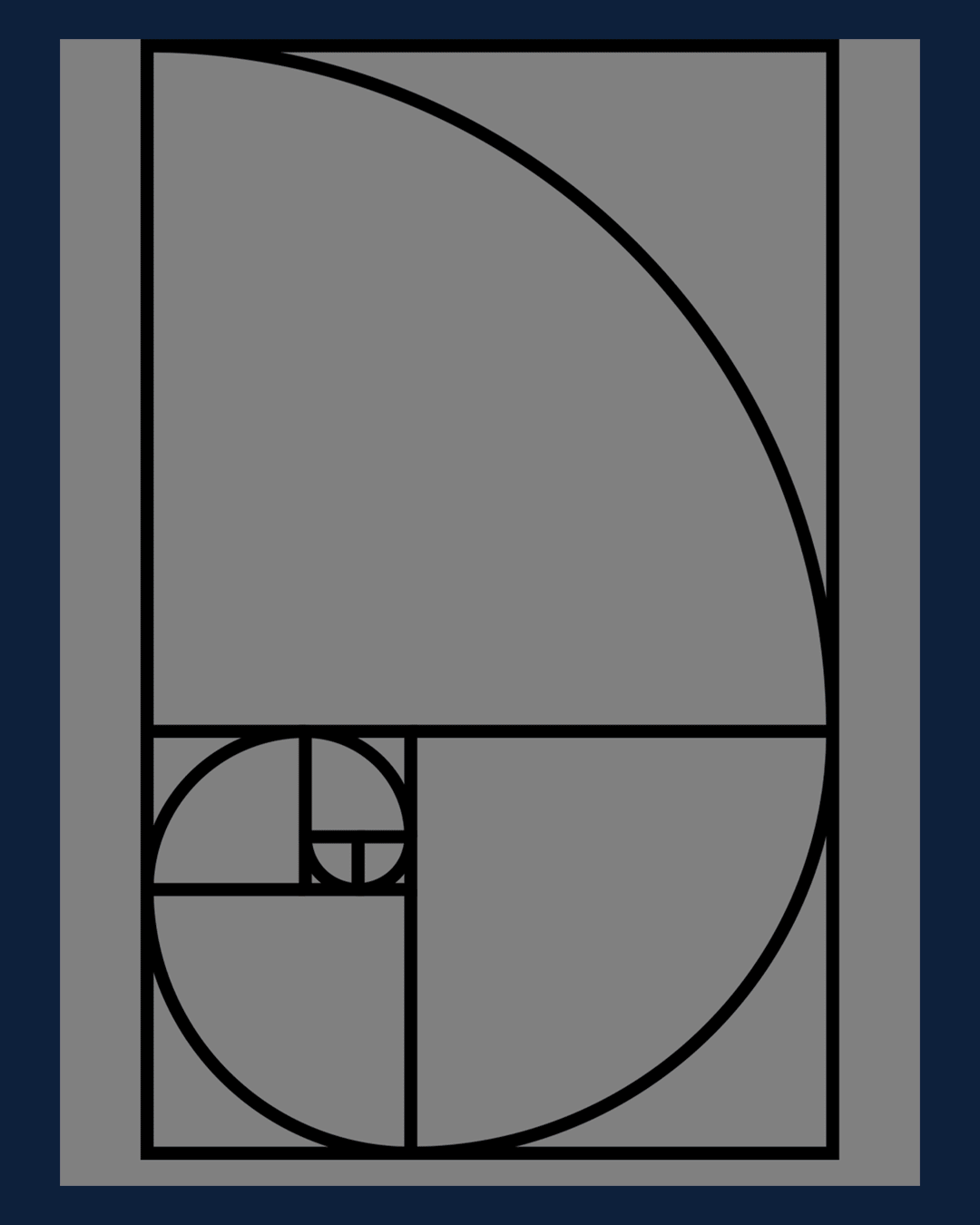
- Establishing the visual hierarchy of the illustration. In this case, I used the Golden Ratio to create a focal point and left an open area at the top for the content.
- Rough to Refined. Using a large brush in Photoshop, I divide the cave opening, the floor, and ceiling. I continue to build on these elements, changing my brush size smaller as I define the details.
- Prep for vectorization. Keeping in mind my stylistic goals, I finalize my sketch to make it easy to "ink" in Illustrator.
Vector Phase:
- Inking. With my refined sketch as a roadmap, I create the lineart with the Pen Tool in Illustrator from foreground to background.
- Creating my color palette. Referencing my images found in my research phase, I decided on a classic color combination: blue and yellow. The cyan and dark blues contribute to the icy, ethereal atmosphere of the caves. I used my "artistic license" for the gradating yellow cave entrance as I wanted the warm tones to draw the eye, allowing the viewer to travel through the cave and resting on the two explorers.
- Adding Fills. With my color palette selected, I added the fill colors and felt happiness as my illustration started to come to life.
- Stylization. I added my handmade gouache brushes to the created lineart and as texture overlays. I also added gradients to the pools of water to create a sense of lively yet chilly shimmer.
Finalization
- Selecting my typeface(s). I chose a robust display typeface due to its functional and classic forms that pays homage to the See America poster series of the past. I made it dark blue to keep it at the foreground as well as to not demand too much attention away from my focal point.
- Adding the content. I ensure all content is within the designated safe areas to eliminate the chances of misprints.
- Finishing touches. Like a garnish on a chef's prized dish, I add the final embellishments to create a complete illustration. In this case, I added reflected light from the cave entrance that I felt was missing.
Challenges
The icy ceiling created an interesting hurdle. How does one create a "painterly" vector that appears to go backward in space? As a designer, I love questions like that because I learn so much from the process of finding the solution. Originally, I started with gradients, but I felt it looked way too digital and it didn't match my original vision. I ended up taking each section of the ceiling into Photoshop and painting the formations with a rough, chalk-like brush. I then imported the results into Illustrator to image trace one by one and put them back into place.
The icy ceiling created an interesting hurdle. How does one create a "painterly" vector that appears to go backward in space? As a designer, I love questions like that because I learn so much from the process of finding the solution. Originally, I started with gradients, but I felt it looked way too digital and it didn't match my original vision. I ended up taking each section of the ceiling into Photoshop and painting the formations with a rough, chalk-like brush. I then imported the results into Illustrator to image trace one by one and put them back into place.
Another challenge was the massive file size that resulted from the textured brushes and amount of objects. Illustrator was running slower and slower as I progressed through the piece. To resolve this, I ensured every major section had its own layer (foreground, midground, background, etc) and the textures for each section had their own layer as well. This helped because I can toggle the textures off as I navigated the canvas. I also removed any unused swatches, graphic styles, and symbols. I reduced excess anchor points through the use of Illustrator's Simplify feature. Finally, I made sure to checkmark "Use Compression" when saving. Believe it or not, this very complex vector file does not crash my computer.